Love, empathy, tolerance--also puppies, flowers, and laundry

Showing posts with label cottage sign. Show all posts

Monday, February 04, 2013

Who In Their Right Mind Would EVER Bring That Home?

I never claimed to be sane, just hopelessly optimistic.

And adept at concealing my treasures from my sweetie which is fortunately easy in our over-stuffed garage.  He's not as bad as I am about dragging things home, but he does currently have four mid-century office desks stacked where car number two would be parked.

Did I mention that my walking partners are Enablers Extraordinaire? Bless their hearts, they are not embarrassed to help me comb through likely-looking garbage cans or walk next to me while I cart a thirty-gallon basket on my head. They even have helped me carry home large planters that neighbors were throwing away. They are true friends!

The Chief Enabler has even gone back with her car to rescue a bit of roadkill too heavy to carry home while I've trotted off to work. So on a chilly drizzly November day, I found this in my driveway when I came home from lunch.

Feel free to shudder. It's truly terrible. Really truly.  Horrid.

The top was upside down in the trash heap that morning so I didn't know what it looked like. I was appalled when I saw it.  Deeply aghast.  Horrified.

(Am I protesting too much?)

The bottom of the coffee table was what "attracted" me.

It had nice legs plus much of the black paint had already flaked off so half the job was already done for me.  I had grandiose visions of converting it into a plush velvet-covered bench.  Or tall footstool.  Or pouf.

Probably rodents have equally delusional thoughts about a free banquet as they approach a box of d-CON.


Anyway, I grabbed that coffee table, disasssembled it and hid away before the neighbors or my husband could see it.  Then did what any crazed crafter would do--complete ignored the legs and began projects using the top that I had no intention of keeping initially.

I've had these letter stashed away since Christmas 2011.

I had planned to buy and paint a nice pine board to mount them for 2012.

But when the free wood showed up...voila!
 
Next Christmas I'll have it surrounded with greenery so it shows up against my white walls.  And I'll straighten that lower-case "r" too. Because it's about a whole eighth of an inch off plumb.

The other drop leaf became a chalkboard that I just finished.


That flaky paint sanded easily. 

The edge stain is a new favorite--Minwax English Chestnut--which nicely frames the blackboard.

The remainder of the tabletop (I sawed part of it off for the bottom of the "mERrY" sign) is sitting on my workbench awaiting a few finishing touches so I can't show it to you yet.  I can tell you it's not going to be white or black or English Chestnut.   Part of the fun of this atrocious roadkill is the total freedom to experiment with anything my brain can conjure!

Once that's done, I'll be looking for some inspirational fabric to complete that fabulously luxurious (or not) upholstered bench.

Bring joy,
 

Sharing my insanity at: Creative Cain Cabin Budget Decorating Party
and at Be Colorful

Friday, January 11, 2013

Tricks for Using Word

I use Word all the time, but I cruised past useful functions for years that I couldn't live without now.

When I was writing my about making my U-Pick Sign, I thought maybe I should point out some of my favorites that you might not know about. Of course, I realize I might just be technologically clueless and you totally know all about this stuff, but at worst you'd just yawn and move on to another blog.

What I was missing all those years was that little "x" icon in the lower right corner.    So type something profound in Word ("Go, Niners!"  "Bob Marley Rules" "Twinkle, Twinkle, Little Star)
 
Highlight it and then click that little "x" and a whole new world opens up.  It's really little but the arrow is pointing at it.

 
Click--Oh look!
 
Effects like Emboss and Engrave and Outline and Shadow.  I use Outline for my sign-making--why waste printer ink when all you want is the outline anyway?  Outline and Shadow made my U-Pick sign lemon-squeezy easy.  Even though lemons weren't listed.

And did you know you can make your font any size, not just the options provided like 28, 36, 48, 72?  Try typing something wild like adding a 1 in front of the 72.  172 pts., please.  Hit Enter and...
 
Cool, huh?

The other incredibly useful feature for signs is the Character Spacing which is the other tab that appears when you click the little "x".  The default spacing is fine for most applications but it's helpful to spread your letters out to fill your horizontal space.  'Cause sometimes you have the perfect font size in height but it's waaaay too squishy side to side. 
 
So click on Expanded from the Spacing menu, then click the little up and down arrows to gradually get the right size.

I pumped this one up by 10 points.
 
It's a fairly subtle change.  But it makes signs easier to paint when all your letters aren't crowding up.  Just sayin'. 

Have fun with it.

Bring joy,
 

Tuesday, January 08, 2013

Signs...Almost Instant Gratification

I love fonts and typography, so it's no surprise that I love to paint signs.

The simplest, easiest one ever is my "U-Pick" sign.
 

 I went with a rustic, primitive look (at least for me).

I had a pallet I scrounged off the curb on garbage day so I simply sawed four equal-length boards off. Equal is a term used loosely here.  Truthfully, I just eyeballed it, reasoning that U-Pick farmers have better things to worry about than quarter inch measurements. Like squash beetles. Or tomato worms.

I decided what fruits and vegetables I wanted to "advertise", and started auditioning fonts. Us font addicts know how important that is. You can have a font that seems perfect until you realize that your words look crappy in it.  Maybe the spacing is off or the curve of the S bugs you. So type out your chosen words and play with various fonts.  I knew I wanted a drop shadow on my sign, so I chose a simple font without a serif.

Good thing that Word has simple fonts because I usually download fancy ones like Jane Austen or Brock Script or Goofball.   One of which might feature in my fancy, picky, perfect cottage sign.
 
I had a bit of my fab unused apple-green paint that I'd mixed up from a previous project so I just slapped it onto the rough pallet wood, not worrying about complete coverage. Good thing too since I had just. barely. enough.

I printed out my words as Outline in Word including the Shadow option, cut them up, and traced them onto my painted boards. I know lots of DIYers use pencil or chalk to transfer, but I prefer my trusty carbon paper from era of typewriters.

I'm lazy,
I have it,
and it works for me.

I traced and painted just the actual letters onto the boards and then used the Shadow version as my painting guide.  Perfect was not my aim, this go 'round.  White and gray provided enough contrast--just like an actual U-Pick sign that needs to be readable while cruising down a country road.  I love the extra pop that the shadow gave this project.

I didn't distress it --the roughness of the pallet wood provided a rustic texture and I figured the elements would contribute over time especially since I didn't put any finish over the latex and craft paint.

What would I change?  I definitely should have scaled "U-Pick" to a font size that takes up most of the vertical space.  It's marginally larger than the other words, but not enough to tell.  And I'm still working on the links between the boards--I need a better way to attach the chain than staples or bent nails.

It reminds me of good times spent up a ladder stuffing my mouth with tree-ripened fruit in the good ol' days and it brought good luck to the garden last summer--we harvested bumper crops of golden razzies, Blue Lake bush beans, Sugar Snap peas, and Early Elbertas which may be the best peaches of all time.  In the depths of cold dark weather, it's good to remember a bit of summer!

Bring joy,


Party On...

Monday, August 16, 2010

Future Eggs 4 Sale

Although I'll take a dozen fresh brown eggs when I visit the Queen Mother this morning, I know I'll come home to four even fresher eggs. The Bombshells are laying fools! Right now, we're keeping up with their production via scrambled eggs and deserving neighbors who chicksit and provide yummies for our girls.

But the day will soon come when we'll need to hang up our official "shingle" announcing we have eggs for sale. I wasn't kidding when I said I had a spare signboard thanks to the Habitat ReStore.  (Ignore the unfinished chicken feeder and the paint destined to transform Kharma's unpainted doghouse into a charming abode and the glass pumpkin waiting for a faux mercury glass spray job.  So many projects...so little time.)
You may think of it as a drawer front, I think of it as a sign-in-waiting. Ummm, do you think I may have been planning this all along?

Of course what should the sign say:  Eggs 4 Sale? Fresh Eggs? Fresh Eggs 4 Sale? Fresh Eggs Today? Fresh Organic Free-Range Brown Eggs? Ack! Too many possibilities.

Avoiding brain overload, I seized the excuse to audition fonts (I'm a font addict) to complement the script used on our Meadowsweet Cottage sign. Some were too heavy. Some were too modern. I settled on Accord Light. It's easy to read and fairly lightweight. Somehow the simplicity of just plain old "Fresh Eggs" turned out to be the right choice with the font. What do you think?
 
I think it fills the space well, but is too large compared to the size and delicacy of the Meadowsweet font.

I printed up another mock-up, this time reducing the size a bit.  Me likee.
 
I'll stretch out the space between the two words, but I think I've got a winner.  I'll print it out in "outline" and transfer it onto my sign blank.  Then guess what I'll be doing this afternoon?  I might not need it for a while, but it'll be ready when I do!

Craftily,


p.s. "Fresh" begins to look misspelled and very strange when you type it over and over different fonts.  Just saying.

Wednesday, March 10, 2010

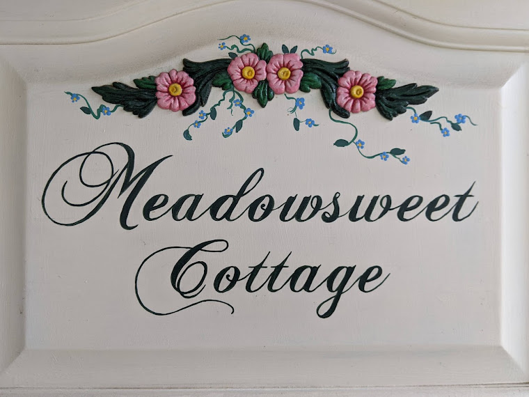
Finally! The Cottage Sign Reveal

Here she is!

I'm very happy with the finished product. Now to seal it for exterior use and mount it.

Thanks to everyone who contributed feedback on the font selection--a pat on the back for you all!

Thursday, February 25, 2010

The Best-Laid Plans...

...are flexible!

Maybe I won't be taking photos of  Blondie-Pie (Kharma's newest nickname) against a dark background as part of my first tutorial (pet silhouettes) anytime soon.

Instead I'll be splicing video footage together for a SnowDogs movie and then uploading to YouTube. At least I will if the dogs cooperate and play while I'm looking instead of the minute I put the camera down.

Maybe I won't be painting my long-planned Meadowsweet Cottage sign just yet.  Getting across town to pick up a new printer cartridge can wait until the streets are free of snow. It'll look like this, more or less.  I just have to re-size the script to fit, print it out, transfer the outlines to the sign, paint, varnish and it'll be ready to hang.  I'm eager to finish!

Instead I'm finishing a new apron--Poulets des Provence.  If chickens are good, then hens living the good life en France are the best.  I don't need another apron for myself (duh!), but I fell in love with the fabric and knew it would make a perfect apron.  I have special plans for this apron so keep your fingers crossed!

Besides the snow, we are dog-sitting.  Zeke is much smaller than our dogs and he's a boy.  We survived his attempts to mark his territory inside our house (he's decided perhaps that's not popular) and he's survived playing with his two much larger "sisters".  He's part of our pack now--but we still watch over him carefully and that means less computer time for me.

 Believe it or not, I'm close to my 400th post.  I think that deserves a celebration so while I'm dog-sitting downstairs, I'm thinking of a fun giveaway. 

Perhaps a package of free snow?  Maybe not.  What about sunny skies?

Monday, February 08, 2010

Catch Up-Catsup-Ketchup

Someone (who shall remain nameless but who does share my bed each night) spent the past three days hogging using my computer rather than his laptop to upload photos.  It slightly cramped my style and caused me severe withdrawal pangs, but he's forgiven since I'm sure he had his reasons.

Thanks to everyone who put their two cents in to help me decide on which font for my Meadowsweet Cottage sign.  Chopin--my favorite too--was the overwhelming choice followed by Brock with scattered applause for Handscript.

My sister Pooh (aka Always Humming) helped in two ways.   Her how-to on s-t-r-e-t-c-h-i-n-g the text were easy-peasy which is exactly the way I like.  She wasn't quite satisfied with any of the fonts.  That made me take a second look and while I liked Chopin a whole lot, I realized I wasn't nuts about the "M".  So I substituted the Brock "M" which I did like and kept the rest Chopin. 

It's perfect, people!  Now to transfer it to the cabinet door sign (which you can see is painted) and also get the decorative oval designed and basecoated.  The front porch is going to look so welcoming with it up this Spring!


^^^
While I'm enjoying Google Reader, it wasn't keeping Amberism's posts updated.  I think I've got that worked out but now I'm realizing her new posts aren't showing up here on Meadowsweet.  Ack!  I'm troubleshooting that now but it means she'll be temporarily absent from my sidebar.  I hope to get her back before her new bundle of joy arrives!  She's been busy recently so you can click on her link here while I play Mrs. Fix-It.

^^^
Ma cousine liked the friend post and sent along a link to this wonderful YouTube video.  This goes in the "I wish I'd said that" category.  Warning: tearjerker of the best kind! Have your Puffs Plus ready.


^^^
I've been craving the LinkWithin widget for months.  It's fun to bounce around related posts on the blogs that have it.  I've learned about furniture, flowers, cloches, chandeliers, chickens, potatoes, and faux mercury glass.  I've tried to install it numerous times and failed every time.  Other bloggers seems to have no problem with it.  They make it look easy.  I've even looked at their source code for inspiration--no luck, although my posts did briefly link to Cindy's at My Romantic Home which was interesting in an unusual way.

I finally gave up yesterday and dumped the whole mess in the laps of the good technowizards at LinkWithin.  With their help and the creek don't rise, maybe Meadowsweet Cottage will finally show you some related links.  I'm reallyreallyreally looking forward to it.  Is it just me or does it make a blog more interesting?  (Yes, yes, my name is pogonip and I'm a websurfing addict, I know.)

  ^^^
I'm so glad I rolled out of bed even though it was cloudy and raining because by the time I got to my Walking Partner's house it was just fresh and the shower had ended.  My cheeks are glowing and my oatmeal is cooking!   Whether you're shoveling snow or mowing the grass, putting on sunglasses or a raincoat, dreaming of flowers or a good night's sleep, wishing the week would be over or happy to be working--have a wonderful week filled with wonderment, surprise and laughter!

Friday, January 29, 2010

I'm Currently Enjoying...

  • Google Reader.  Where have you been all my life?!  I've subscribed to all my favorite blogs (even those of you who haven't posted anything for nearly two years--you know who you are).  I'm saving sooooo much time now that I don't need to click on your URL only to find out that there's nothing new that I have time for posting on my own blog.  You know you were wondering where I find the time...
  • Netflix.  Through the mail DVDs or Watch Instantly.  I've never seen so many movies in such a short time in my whole entire life (including high school when we'd watch anything, remember?)--blockbusters, foreign language, Pixar, TV series, classics, tearjerkers, adventure.  The best ones recently:  Julie and Julia (Meryl Streep is amazing in anything!), and a little one titled Outsourced.  I can never predict what I'll merely like, what I'll enjoy and what I'll absolutely love.
  • Ironing new fabric--with a Netflix movie (Watch Instantly) on in the background.  I had no idea that Lord Byron was such a bad boy!
  • Longer days.  All the clouds and rain are more reminiscent of a northern California February replete with green hills and newborn lambs than a wintery northern Nevada January.  We have no verdure and no lambie pies, alas, but it smells like spring.
  • A three day week, thanks to the flu. On the other hand...
  • Being healthy and going to work.  It sure beats aches and lethargy.
  • A January devoted to as many arts and crafts as I can jam in.  I'm leaving no room for any post-holiday letdown or depression.
  • Creamy white paint warm enough to use.
  • A first coat on my cottage sign.

Thursday, January 28, 2010

S-T-R-E-T-C-H-E-D

On this bright and sunny afternoon, just after Kharma and I took a short jaunt to the pasture to practice our heeling skills and to chase the flock of Canada geese (giving them a little much-needed exercise), I grabbed my trusty hand sander and successfully sanded the finish off my maple sign.  I also dug out my can of creamy white paint in the garage and wondered yet again who named it Sleepy Eyes and why.

The sign is ready for a basecoat but the refrigerated paint has to warm up in the powder room.  Tomorrow I'm hoping to paint if the nice weather sticks around just a tad longer.

I did outline the arched area on paper and discovered that if I held it right up in front of the computer screen I could get an idea what the prospective fonts look like.  I'm going to have to stretch the winner waaaaay out almost two extra inches to fill the space.  So I'll be investigating what program will digitally stretch the calligraphy without losing the stylish feel of it. ( I hope it won't be a steep learning curve.)

I'm getting excited--it's going to look so good!  Keep those votes and comments coming on the best font--and if you find another that might work, pass it on to me.

Wednesday, January 27, 2010

Whaddaya Think?

I'm dithering pondering thoughtfully as usual and I could use your help.

I found the cabinet door carved sign of my dreams and I'm looking for the perfect "Meadowsweet Cottage" font to paint on it. You know--the one that stylishly says smiles, clematis blossoms, apple green paint, kitchen aprons, homemade soup, crocheted lace, and daffodil yellow walls.  The font that hints of Belgian chocolate and dog kisses and ruffles while kindly ignoring dirty fingernails.

I think the arch will showcase an oval with a little painted flower, then our cottage name beneath.  The maple stain isn't staying--I think creamy white will look nice against our tan walls.

The choices thus far,  in alphabetical order:
Brock


Chopin


Grenoble Outline (but it would be filled in, just saving ink here)


Handscript 
I just love the way Blogger wouldn't upload the word files, so I had to photograph the computer screen. 


Liffey


I like'em all and can't decide.  Help me narrow them down! Pretty please? With peanut-butter chunk ice cream on it?