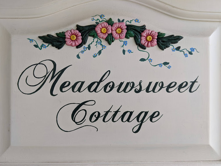
On this bright and sunny afternoon, just after Kharma and I took a short jaunt to the pasture to practice our heeling skills and to chase the flock of Canada geese (giving them a little much-needed exercise), I grabbed my trusty hand sander and successfully sanded the finish off my maple sign. I also dug out my can of creamy white paint in the garage and wondered yet again who named it Sleepy Eyes and why.
The sign is ready for a basecoat but the refrigerated paint has to warm up in the powder room. Tomorrow I'm hoping to paint if the nice weather sticks around just a tad longer.
I did outline the arched area on paper and discovered that if I held it right up in front of the computer screen I could get an idea what the prospective fonts look like. I'm going to have to stretch the winner waaaaay out almost two extra inches to fill the space. So I'll be investigating what program will digitally stretch the calligraphy without losing the stylish feel of it. ( I hope it won't be a steep learning curve.)
I'm getting excited--it's going to look so good! Keep those votes and comments coming on the best font--and if you find another that might work, pass it on to me.


Highlight the text, then under Format, try Font, then character spacing. You might find that you can expand one font and not another and that may influence which font you choose.
ReplyDeleteI can't wait to see the finished product!
ReplyDeleteExpanding the font works! I had to increase by several points but it sure is an easy way to stretch it out!
ReplyDelete